插槽
阅读此章节时,我们假设你已经读过组件基础,若你对组件还完全不了解,请先阅读它。
插槽内容与插口
我们已经学习过组件能够接收任意类型的 JavaScript 值作为 props,但组件要如何接收模板内容呢?在某些场景中,我们可能想要为子组件传递一些模板片段,让子组件在它们的组件中渲染这些片段。
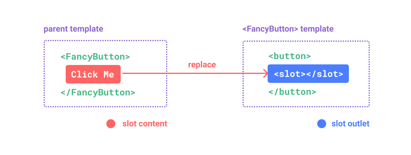
举个例子,这里有一个 <FancyButotn> 组件,可以像这样使用:
<FancyButton>
  点击这里 <!-- 插槽内容 -->
</FancyButton>
而 <FancyButton> 的模板是这样的:
<button class="fancy-btn">
  <slot></slot> <!-- slot outlet -->
</button>
<slot> 元素是一个插槽的插口,指出了父元素提供的插槽内容在哪里被渲染。
最终渲染出的 DOM 结果是这样:
<button class="fancy-btn">
  点击这里
</button>
<FancyButton> 通过插槽承担了渲染 <button> 这个外壳 (以及想要的样式),而内部的内容由父元素提供。
若你想换一种方式理解插槽,那么不妨和 JavaScript 的函数作个比较:
// 父元素传入插槽内容
FancyButton('点击此处')

// FancyButton 在自己的模板中渲染插槽内容
function FancyButton(slotContent) {
  return (
    `<button class="fancy-btn">
      ${slotContent}
    </button>`
  )
}
插槽内容不仅仅局限于文本。它也可以是任意合法的模板内容,例如我们可以传入一些元素,甚至是组件:
<FancyButton>
  <span style="color:red">试试点击这里!</span>
  <AwesomeIcon name="plus" />
</FancyButton>
当有了插槽之后,<FancyButton> 组件变得更灵活,也更容易复用。我们现在可以在不同的地方使用它,传入不同的内容,但都具有相同的外部样式。
Vue 组件的插槽机制是受到了原生 Web Component <slot> 元素的启发,但也作出了一些功能的拓展,我们后面就会看到。
渲染作用域
插槽内容可以访问到父组件的数据,因为插槽内容本身也是在父组件模板的一部分。举个例子:
<span>{{ message }}</span>
<FancyButton>{{ message }}</FancyButton>
这里的两个 {{ message }} 插值表达式渲染的内容都是一样的。
插槽内容无法访问子组件的数据,请牢记一条规则:
任何父组件模板中的东西都是被编译到父组件的作用域中;而任何子组件模板中的东西都只被编译到子组件的作用域中。
默认内容
我们也经常会遇到外部没有提供任何内容的情况,此时可能会为插槽提供一个默认的内容来渲染。比如在 <SubmitButton> 组件中:
<button type="submit">
  <slot></slot>
</button>
如果外部没有提供任何插槽内容,我们可能想在 <button> 中渲染“提交”这两个字。要让这两个字成为默认内容,需要写在 <slot> 标签之间:
<button type="submit">
  <slot>
    提交 <!-- 默认内容 -->
  </slot>
</button>
当我们在父组件中使用 <submit-button> 但不提供任何插槽内容:
<SubmitButton />
那么将渲染出下面这样的 DOM 结构,包含默认的“提交”二字:
<button type="submit">提交</button>
但如果我们提供了别的内容给插槽:
<SubmitButton>保存</SubmitButton>
那么渲染的 DOM 中会选择使用提供的插槽内容:
<button type="submit">保存</button>
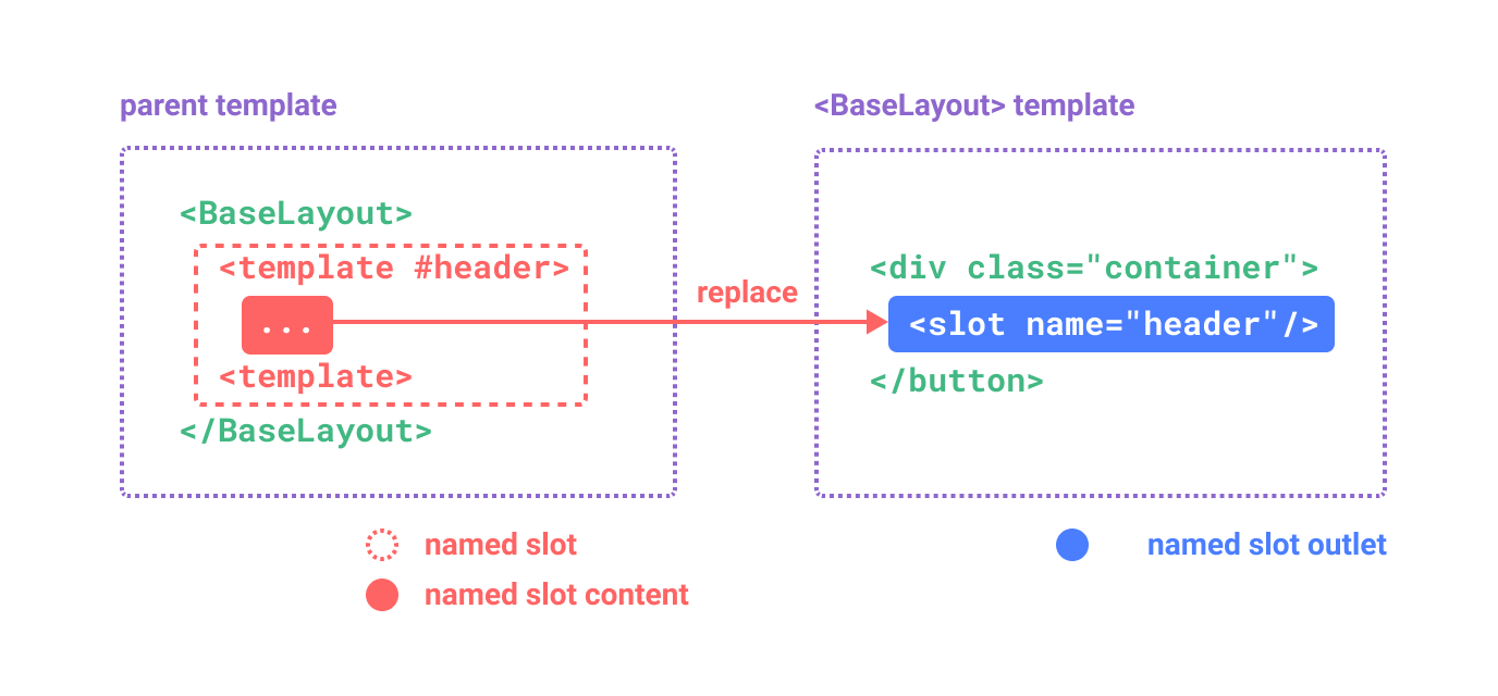
具名插槽
有时一个组件中可能会有多个插槽的插口。举个例子,在一个 <BaseLayout> 组件中,有如下这样的模板:
<div class="container">
  <header>
    <!-- 标题内容放这里 -->
  </header>
  <main>
    <!-- 主要内容放这里 -->
  </main>
  <footer>
    <!-- 底部内容放这里 -->
  </footer>
</div>
对于这种场景,<slot> 元素可以有一个特殊的 attribute name,可以是一个独一无二的标识符,用来区分各个插槽,确定每一处最终会渲染的内容:
<div class="container">
  <header>
    <slot name="header"></slot>
  </header>
  <main>
    <slot></slot>
  </main>
  <footer>
    <slot name="footer"></slot>
  </footer>
</div>
没有提供 name 的 <slot> 插口会隐式地命名为“default”。
在父组件中使用到 <BaseLayout> 时,我们需要给各个插槽传入内容,为了模板片段让各入各门、各寻其所。此时就需要用到具名插槽了:
要为具名插槽传入内容,我们需要使用一个含 v-slot 指令的 <template> 元素,并将目标插槽的名字传给该指令:
<BaseLayout>
  <template v-slot:header>
    <!-- header 插槽的内容放这里 -->
  </template>
</BaseLayout>
v-slot 有对应的简写 #,因此 <template v-slot:header> 可以简写为 <template #header>。其意思就是“将这部分模板片段传入子组件的 header 插槽中”。
下面我们给出完整的、向 <BaseLayout> 传递内容的代码,指令均使用的是缩写形式:
<BaseLayout>
  <template #header>
    <h1>这里是一个页面标题</h1>
  </template>

  <template #default>
    <p>一个文章内容的段落</p>
    <p>另一个段落</p>
  </template>

  <template #footer>
    <p>这里有一些联系方式</p>
  </template>
</BaseLayout>
When a component accepts both default slot and named slots, all top-level non-<template> nodes are implciitly treated as content for default slot. So the above can also be written as:
<BaseLayout>
  <template #header>
    <h1>Here might be a page title</h1>
  </template>

  <!-- implicit default slot -->
  <p>A paragraph for the main content.</p>
  <p>And another one.</p>

  <template #footer>
    <p>Here's some contact info</p>
  </template>
</BaseLayout>
Now everything inside the <template> elements will be passed to the corresponding slots. The final rendered HTML will be:
<div class="container">
  <header>
    <h1>这里是一个页面标题</h1>
  </header>
  <main>
    <p>一个文章内容的段落</p>
    <p>另一个段落</p>
  </main>
  <footer>
    <p>这里有一些联系方式</p>
  </footer>
</div>
我们还是用 JavaScript 函数的作类比来理解:
// 传入不同的内容给不同名字的插槽
BaseLayout({
  header: `...`,
  default: `...`,
  footer: `...`
})

// <BaseLayout> 渲染插槽内容到对应位置
function BaseLayout(slots) {
  return (
    `<div class="container">
      <header>${slots.header}<header>
      <main>${slots.default}</main>
      <footer>${slots.footer}</footer>
    </div>`
  )
}
动态插槽名
动态指令参数在 v-slot 上也是有效的,即可以定义下面这样的动态插槽名:
<base-layout>
  <template v-slot:[dynamicSlotName]>
    ...
  </template>

  <!-- 缩写为 -->
  <template #[dynamicSlotName]>
    ...
  </template>
</base-layout>
注意这里的表达式和动态指令参数受相同的语法限制。
作用域插槽
在上面的渲染作用域中我们讨论到,插槽的内容无法访问到子组件的状态。
然而在某些场景下插槽的内容可能想要同时利用父组件域内和子组件域内的数据。要做到这一点,我们需要让子组件将一部分数据在渲染时提供给插槽。
而我们确实也有办法这么做!我们可以像对组件传递 props 那样,向一个插槽的插口上传递 attribute:
<!-- <MyComponent> 的模板 -->
<div>
  <slot :text="greetingMessage" :count="1"></slot>
</div>
当需要接收插槽 props 时,一般的默认插槽和具名插槽的使用方式有了一些小小的区别。下面我们将会展示是怎样的不同,首先是一个默认插槽,通过子组件标签上的 v-slot 指令,直接接收到了一个插槽 props 对象:
<MyComonent v-slot="slotProps">
  {{ slotProps.text }} {{ slotProps.count }}
<MyComponent>
子组件传入插槽的 props 作为了 v-slot 指令的值,可以在插槽内的表达式中访问。
你可以将作用于插槽类比为一个传入子组件的函数。子组件会将相应的 props 作为参数传给它:
MyComponent({
  // 类比默认插槽,将其想成一个函数
  default: (slotProps) => {
    return `${slotProps.text} ${slotProps.count}`
  }
})

function MyComponent(slots) {
  const greetingMessage = 'hello'
  return (
    `<div>${
      // 在插槽函数调用时传入 props
      slots.default({ text: greetingMessage, count: 1 })
    }</div>`
  )
}
实际上,这已经和作用域插槽的最终的代码编译结果、以及手动地调用渲染函数的方式非常类似了。
v-slot="slotProps" 可以类比这里的函数签名,和函数的参数类似,我们也可以在 v-slot 使用:
<MyComonent v-slot="{ text, count }">
  {{ text }} {{ count }}
<MyComponent>
具名作用域插槽
具名作用域插槽的工作方式也是类似的,插槽 props 可以作为 v-slot 指令的值被访问到:v-slot:name="slotProps"。当使用缩写时是这样:
<MyComponent>
  <template #header="headerProps">
    {{ headerProps }}
  </template>

  <template #default="defaultProps">
    {{ defaultProps }}
  </template>

  <template #footer="footerProps">
    {{ headerProps }}
  </template>
</MyComponent>
向具名插槽中传入 props:
<slot name="header" message="hello"></slot>
注意插槽上的 name 是由 Vue 保留的,不会作为 props 传递给插槽。因此最终 headerProps 的结果是 { message: 'hello' }。
一个漂亮的列表示例
想要了解作用域插槽怎么样使用更好吗?不妨看看这个 <FancyList> 组件的例子,它会渲染一个列表,其中会封装一些加载远端数据的逻辑、并提供此数据来做列表的渲染,或者是像分页、无限滚动这样更进阶的功能。然而我们希望它能够灵活处理每一项的外观,并将对每一项样式的控制权留给使用它的父组件。我们期望的用法可能是这样的:
<FancyList :api-url="url" :per-page="10">
  <template #item="{ body, username, likes }">
    <div class="item">
      <p>{{ body }}</p>
      <p>作者:{{ username }} | {{ likes }} 人赞过</p>
    </div>
  </template>
</FancyList>
在 <FancyList> 之中,我们可以多次渲染 <slot> 并每次都提供不同的数据 (注意我们这里使用了 v-bind 来传递插槽的 props):
<ul>
  <li v-for="item in items">
    <slot name="item" v-bind="item"></slot>
  </li>
</ul>
无渲染组件
上面的 <FancyList> 用例同时封装了可重用的逻辑 (数据获取、分页等) 和视图输出,但也将部分视图的最终输出通过作用域插槽交给了消费者组件来管理。
如果我们将这个概念拓展一下,可以想象的是,一些组件可能只包括了逻辑而不需要自己渲染内容,视图的输出通过作用域插槽全权交给了消费者组件。我们将这种类型的组件称为无渲染组件。
这里有一个无渲染组件的例子,一个封装了追踪当前鼠标位置逻辑的组件:
<MouseTracker v-slot="{ x, y }">
  鼠标位于:{{ x }}, {{ y }}
</MouseTracker>
虽然这是一个有趣的模式,但能用使用无渲染组件实现的大部分功能都可以通过组合式 API 以另一种更有效的方式实现,且不会产生额外的组件嵌套的开销。之后我们会在组合一章中介绍如何更高效地实现追踪鼠标位置的逻辑。
尽管如此,作用域插槽还是在需要同时封装逻辑、组合视图界面时很有用,就像上面的 <FancyList> 组件那样。